Our Branding
Our Name
It took us just a few hours to agree on the name for our community. “Our Conscious Path” is elegant and evocative, instantly suggesting community, awareness and an evolutionary journey.
It perfectly reflects our vision and mission. “Our Conscious Path” is a name that inspires a shared, mindful journey of self-awareness, growth and spiritual exploration, perfect for a community platform dedicated to promoting conscious living.
Mindful Exploration
“Conscious Path” suggests a purposeful, intentional journey, where every step is taken with mindfulness and awareness. It indicates a focus on self-discovery, personal growth or spiritual evolution with an emphasis on intentionality.

Collective Growth and Awareness
“Our” implies a shared journey, a communal or collective experience of conscious growth. It can represent a community or even humanity moving toward greater awareness, unity, transformation and growth.

Holistic Journey
The combination of “conscious” and “path” suggests a journey that is not just physical but also emotional, mental & spiritual. It implies that the path being followed is aligned with higher purpose, truths and balance.

Guidance and Direction
The word “path” also evokes the idea of a road or route, guiding people toward awareness, healing, or transformation. It suggests that you may have found a source of guidance for living more consciously.

Unity and Connection
“Our” also fosters a sense of inclusivity, inviting everyone to participate in the journey. It conveys the idea that we are all on this path together, suggesting a platform for community, sharing and growth.
Our Logo
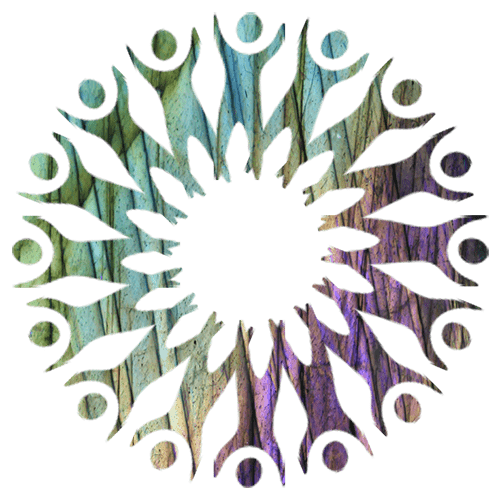
The tree of people forming the branches feels alive, very symbolic of our vision and mission and is energetically strong. The texture in the logo gives it a grounded, elemental feel. Together they speak of deeper meaning, presence, growth & evolution.
A few different images of Labradorite are used to provide the colour in the logo variants. Labradorite’s symbolism is of deep transformation, intuition, grounding, and protection; exactly the kind of energy that mirrors OCP’s mission and purpose.
Symbolism & Impact
The tree formed of people, rooted in earth, reaching upward in unison, perfectly reflects: individual growth within collective evolution. The little figure at the bottom of the path says:
“This is your path. You are part of something bigger.”
Palette & Variants
Having multiple color tones gives us more versatility without breaking brand unity. The round version is perfect for icons, social media, avatars, stamps or merchandise, while the landscape version works beautifully on web headers, documents, and in email footers.
Hierarchy & Tiers
The colour variations allow us to visually signal membership levels, season, purpose or categories in an elegant and intuitive way, connected to our overall branding.
